GREEN HAND
GREEN HAND
THE MISSION
There was a time my family traveled to Arizona to visit some family friends, and in every neighborhood we drove through an overwhelming majority of the houses had grass in their yards. I was much more impressed with the homes that used native cacti and xeriscaping both for visual appeal and for their mindfulness regarding water use. With this in mind, I wanted to create an environmental campaign centered around replacing lawns with other less wasteful alternatives.
THE IDEA
Using other environmental campaigns as reference, I noticed that they all did not seem to resonate with people as much as they had hoped. I believe it’s because they don’t center their message around the direct benefit to the individual and instead are trying to sell people on benefits that they are unlikely to see or notice and therefore are much more abstract. I focused my entire campaign on the individual benefits of replacing lawns as a way to reach people better.
THE PROJECT
Logo / Branding
Print Collateral
Brochure
Seed Packets
Booklet
Yard Signs
Posters / Infographics
THE PROCESS
I began by creating a persona of who my primary audience would be. This informed all of my later design choices and how I chose to word all the content for my deliverables.
image courtesy of unsplash
“Mary Culligan” is a 57-year-old woman who lives in Fort Wayne, IN and who works as a Sol’s Manager. She leans further right on the political spectrum and while she does believe in climate change, she thinks a large majority of it is being blown out of proportion by climate alarmists.
With the audience established, I could officially start the design process for my project.
I named my campaign GREEN HAND as a play on the expression “green thumb”, but instead of just your thumb, you’re using your whole hand. This was done to reflect the personal nature of the project and that each person can be environmentally conscious while also directly benefiting themselves.
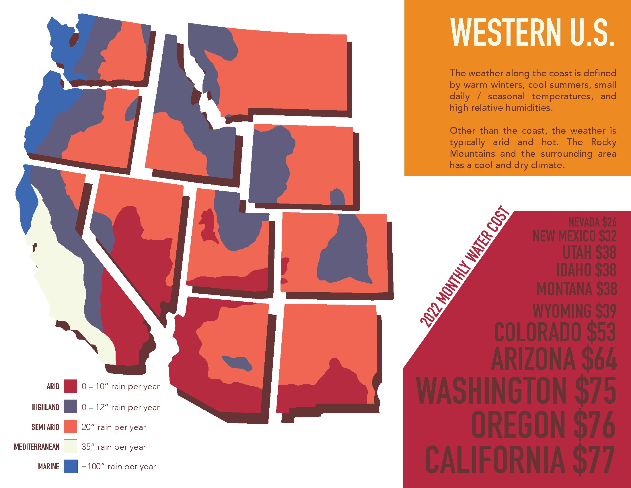
From there, I researched the various climate regions in the U.S. and created infographics that detailed the weather patterns, annual water cost of the states in the region, and general information about the area’s climate.
Dividing the country into four sections (southwest, northeast, south, and midwest) made the most sense based on climate patterns, and each region was given its own unique color palette to distinguish it from the others.
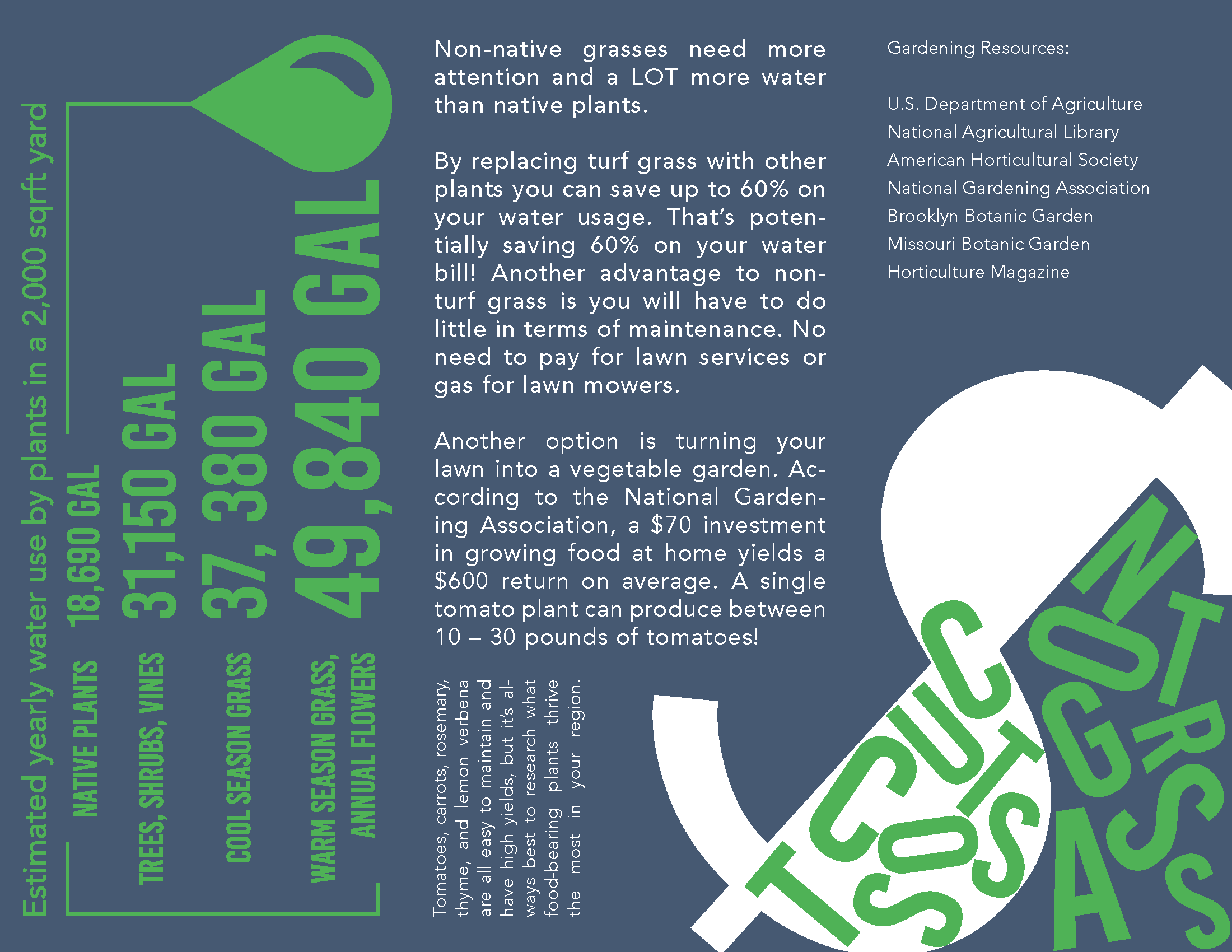
For the brochure, I wanted it to serve as an introductory product that was a summary of GREEN HAND that could be sent through the mail or displayed at a booth or something of that sort.
I started with the inner page of the brochure and experimented with the placement of the contents until I found one that was best suited for my audience. From there it was a only a matter of choosing colors and deciding which variation worked best.
Once I had the inner content of the brochure figured out, the design for the front came shortly after as there was significantly less content that needed to be put on the three front sections.
The Lawn Removal Guide originally started out as an abridged almanac for what kinds of plants homeowners can put in their yards depending on their region. However, after some drafting, it became clear that switching to a guide on how to remove lawns would better suit my project.
Part of the almanac was going to detail the different climate regions of the U.S., and those graphics ended up becoming their own deliverables for the project.
The greatest struggle for this was trying to balance body text placement. The first drafts were too busy and caused the reader’s eye to bounce across the page too much. In my attempt to be unique, I was sacrificing readability which would likely turn most older people away from reading the guide, completely undermining the goal of my project.
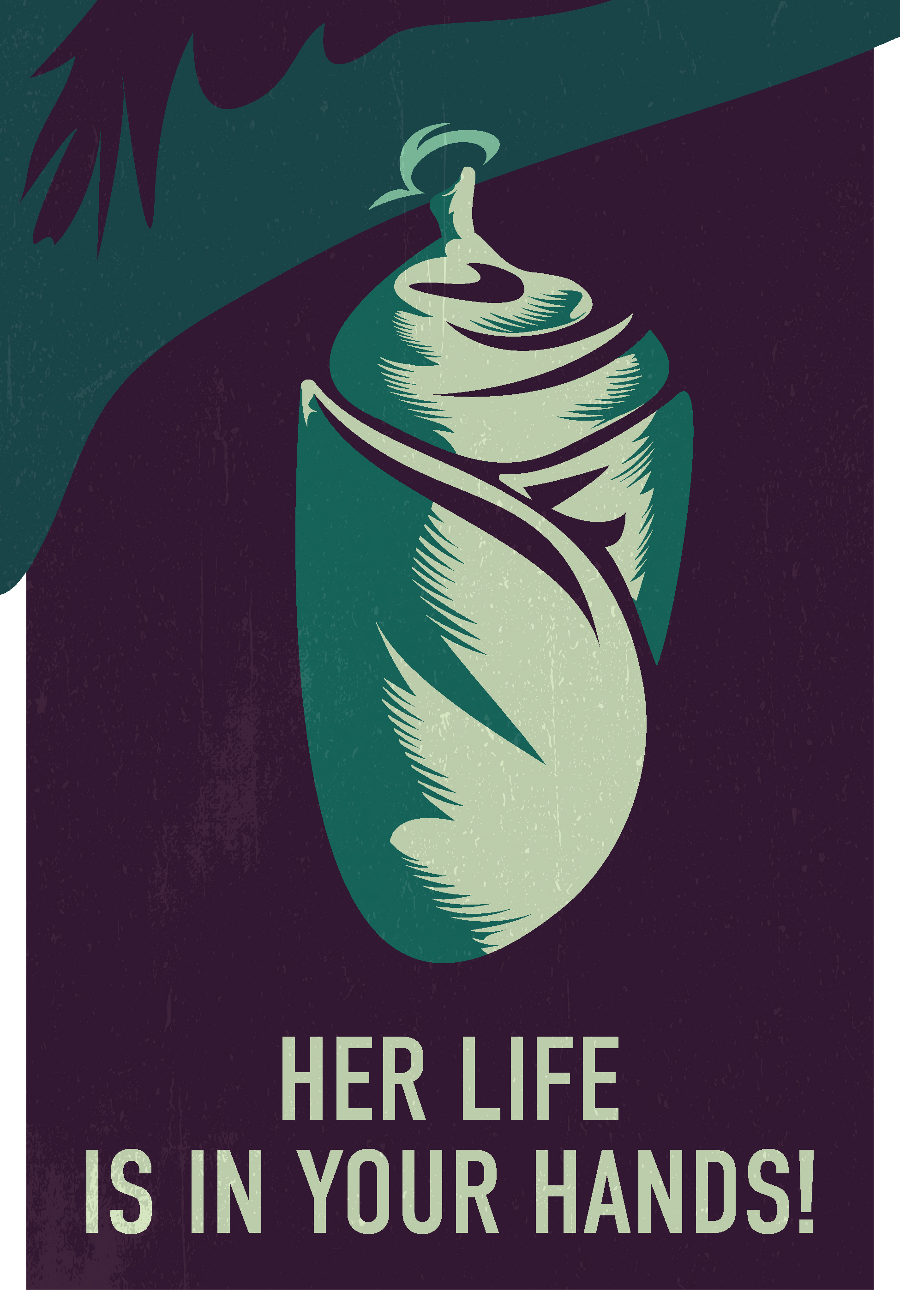
The infographics were originally going to be posters, but I decided it would be better to have them resemble web graphics instead which could be included on a website or social media post. The three “propaganda” posters was me wanting to create something that would appeal to a younger audience so that they could spread the campaign.
Each infographic details one of the four regions’ weather patterns, water cost from 2022, and other climate-related information. The posters were primarily inspired by Soviet-era, WWI posters with bold colors and a concise call to action.
Part of my project was also creating a website prototype which would serve as the online equivalent to the various physical deliverables I created in addition to providing another medium for the campaign to exist in.
The landing page includes an introduction to the campaign, why people should care about grass lawns, and a few “at-a-glance” facts to get people’s attention. This was also my opportunity to include motion elements for my project as well.
Besides replacing grass with native plants, using the land around your home to grow vegetables, herbs, and fruits is also an alternative mentioned in my project. As such, I created seed packets for carrots, tomatoes, and basil which are three of the heartiest and easiest produce to grow
Using type as the primary design element really began with the creation of these packets. In doing research on other seed packet designs, I noticed that none of them used type beyond just the body text at all; this was the main inspiration for why I chose to approach my packet design with a more type-heavy style.
Many of the houses in my neighborhood (which is primarily people in my audience’s age range) have at least one yard sign for at least half the year. This inspired me to create yard signs of my own that people could use to “advertise” their converted yards.
The first was a more humorous sign which was aimed at sparking “friendly contention” between neighbors. The goal is that the people who replace their lawns would poke fun at their neighbors who have not which would ideally point them to GREEN HAND. The second is a much more general sign which highlights the benefits of biodiversity in an area.
The I “heart” Biodiversity sign uses colors from the palettes I created for the four United States regions as a way to create visual interest and to also reinforce the message of the sign itself by incorporating various colors from the four regions.


